Showing posts with label art critique. Show all posts

Tuesday, August 12, 2014

My 1st Children's Book

A few years ago while living in Tahoe, I was searching out creative work and stumbled upon a writer meetup. I'm a graphic design and illustrator...writers need me!! and I need them!! So I crashed the writer meetup with homemade carrot cake in hand and was welcomed on all accounts.

One of the writers later asked me to illustrate his children's book, which has been on bucket list since I was a little girl. Well, I said YES, of course! It has been almost three years in the making, but it is finally finished and I am heading to Tahoe today for a book tour around the lake.


PRESS RELEASE
Local Author publishes Children’s book about Lake Tahoe.

Gertrude’s Tahoe Adventures in time, a children’s book about the natural history of Lake Tahoe, was recently published. With colorful and dramatic illustrations the book tells the story of Gertrude, a Tahoe girl who meets a magic maiden who takes her on a fast motion adventure through the history of Lake Tahoe. They watch glaciers march, volcanoes erupt and exotic animals graze while becoming forever friends.

Gertrude is authored by long time Tahoe resident Tim Hauserman, who wrote: Tahoe Rim Trail: The official guide for hikers, mountain bikers and equestrians, as well as Monsters in the Woods: Backpacking with Children and Cross-country skiing in the Sierra Nevada. The book is illustrated by Jess Bechtelheimer, who worked hundreds of hours to create the incredible paintings which are the backdrop for the book. Hauserman says, “When I first saw the paintings, tears came to my eyes. I felt so lucky that she joined me in the project.”

Hauserman says “the goal for the book is to give both children and adults a fun and accessible introduction to how Tahoe became the unbelievable place it is today.

Bechtelheimer says,“We found a way to celebrate and playfully immortalize this place that we love - for those who call it home and for those of us that can't always be here and instead dream of Tahoe from afar.”


SCHEDULE
Hauserman and Bechtelheimer will be available to sign copies of Gertrude on:
August 13th at the Bookshelf in Truckee at 6pm.
August 14th at Grassroots Books in Reno at 10:30am-12:30pm,
and Truckee Thursday from 4-6pm.
August 15th at Ruffles and Ruffnecks in Tahoe City from 11am-1pm.
August 16th at Sundance Books in Reno from 3-4:30pm.

August 23rd at Explore Tahoe in South Lake Tahoe (time TBD)


It is available for purchase at The Bookshelf in Truckee; Ruffles and Ruffnecks, The Store and The North Lake Tahoe Visitor Center in Tahoe City; Tahoe Mountain Sports in Kings Beach; Sundance Books and Grass Roots Books in Reno, and online.

Thursday, June 30, 2011

Frolic in the Flowers

That's the title of a painting I've been working on lately. I shared pictures of it a couple months ago, in an early state. I have since then added an element.


I haven't decided if it's 'finished' or not. What do you think?Link

Thursday, May 27, 2010

Art Critique #3

Art Critique #3: MONKEY AROUND

16"x20" acrylic painting

I'm not sure if its 'done' or not. What do you think?

It's been awhile since I did an art critique so I'm kind of excited! I love hearing others ideas and feedback. Good, Bad, and Ugly. Suggestions. thumbs up. what ever you feel inclined to share. Just let me have it :)

Friday, March 26, 2010

Art critique #2 - follow up


Follow up to art critique #2. Yes, I know it took so long for me to follow up on this one that you've probably completely forgotten about it. So if you need a refresher, check out Art Critique #2 and even read the comments/suggestions given. I have taken some of your advise and of course throw some of my own in there.... still not sure if it's completely done, but done enough is what I'm telling myself. It's time to move on. (actually I cheated and painted something else, too... I'll share that with you next week.)

If you have suggestions or feedback, it's still welcome. That's what these critiques are all about.
This one is pretty different than what I usually do... experimenting :)


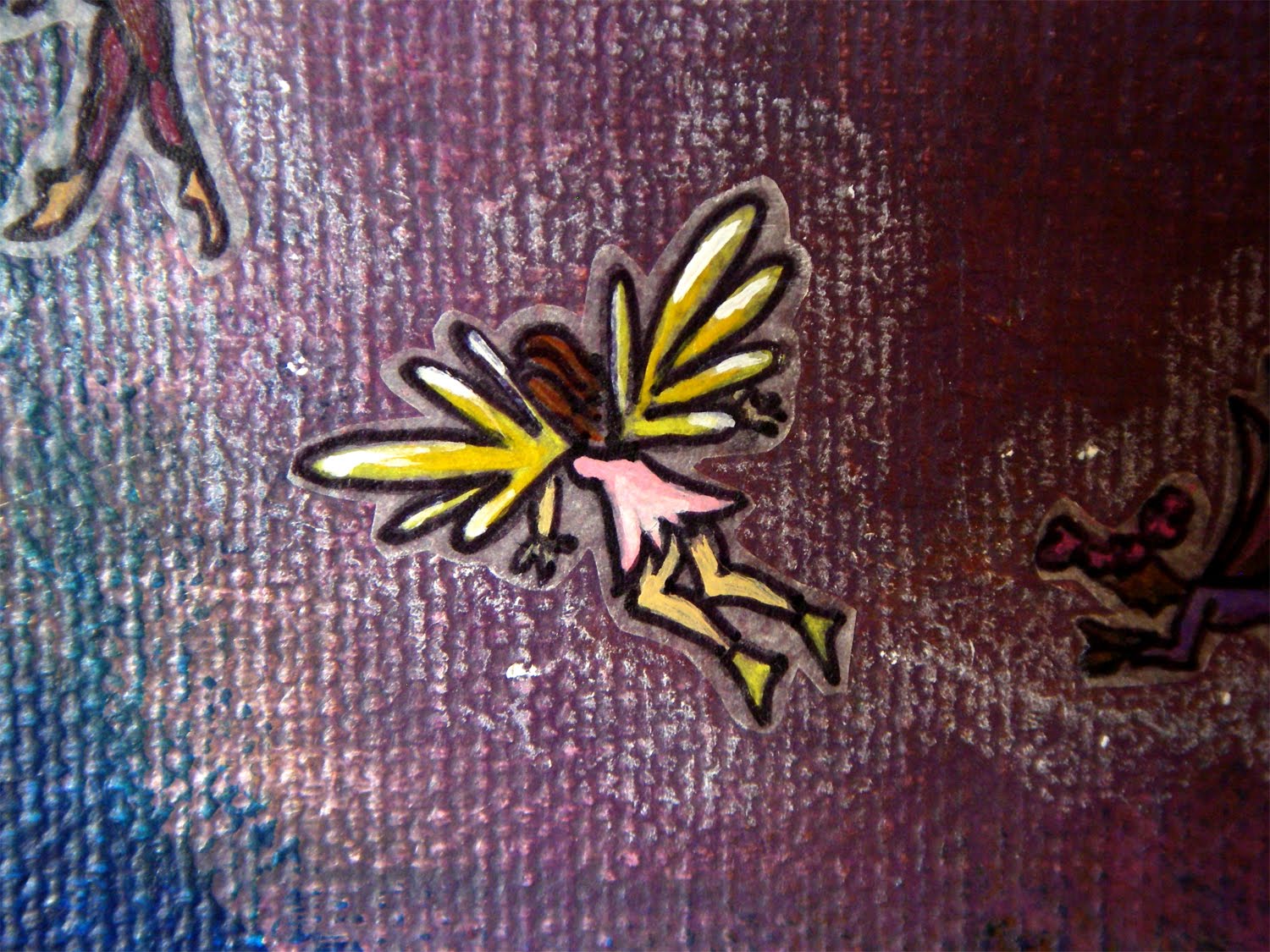
just fyi... most of the fairies are an inch or less in height/length


Friday, November 6, 2009

Art Critique #2

Alright, I am ready for the next critique. Hope you are too.

This particular painting is... well more of an experimental process. I found an artist here in Asheville that I really like and watched this youtube video about her process. I thought, "ok. i'll try it." So I started...wait. Let me first tell you that this is a canvass I bought at a moving sale. I have painted over her abstract painting. However, she used some kind of paste to create some different textures and lines. This has become the biggest challenge. Neither I nor my main source of encouragement (maybe soon to be you, though :) ) likes the texture. I have tried to subtly build a little paste of my own over it. Then I repainted it. It's arguable whether or not it helped. I don't want to kill a ton of paste on it, just to have it look awful and obvious that its a cover-up. This has kind of led me away from the original process.

Ok. So I started painting the canvass like Jane Filer explains that she does. Just putting done random colors here and there. Using the oldest paint or some I have a lot of. not worrying so much about the color combinations. walked away for a few days or more. add some color here or there again. a few more days away. finally stared into it like you would the clouds, and objects emerged from my strokes. 2 dragons and a tall building. the tall building consists mostly of the texture. i outlined and highlighted a little to bring forth the dragons for all to see.

This is its current painted state. If you would, look at this for a bit and form your ideas before reading what i have in mind.

big picture


(my favorite corner. its not quite as dark as the big picture indicates. the right side of the big picture is a little washed out from the sunlight.)


textures


dragon details


the building

.
.
.
.

if you are having a hard time forming any ideas, either walk away from it for a bit (believe me, i have spent lots of time contemplating it so if you take awhile to think about it that's fine. i so so appreciate your feedback) or you can read on and form an idea from there.
.
.
.
.
.
.


everyone good?

ok. this is my current plan of attack. i have drawn and cut out fire that i plan to decoupage on as so. paint it reds, oranges, and yellows.


then i got stuck again. ive been working on this one for quite awhile. i decided it needs more characters. so i started sketching a sort of woodland fairy. but she's a little big in comparison to the dragons. plus she's not quite enough. so i've starting drawing some little fairies that are tiny like bugs or birds in comparison to the dragons. i figure she is their leader and so its ok if she's big. and so the story of the painting continues to develop. she and the little ones are fleeing/fighting the fire. i plan to draw a bunch more of the little ones. coming out of the building's windows and flying left to her and then maybe swooping down and around the building where there is sort of a swirl of colors below the building before the fire. im hoping the story will over power the texture and the fire will break up its pattern. not sure if this is enough. enough to make it good. something that im happy with.


Woodland fairy and friends

(woodland fairy head placed to indicate where she will go)


hugs and kisses to everyone for "playing along"!

happy friday

Wednesday, November 4, 2009

Art Critique #1 - follow up

So I lightened the words. kind of made them fade into the objects (clouds, sky, and horses) behind them. still very readable. i looked at it and thought, yay! looks good. took some pics to post the results and then for fun pulled up the before pics. Which I happened to like better at that moment. so more contemplation. im hesitant to do 'too much' and ruin the "whimsical feel".
But it wasn't quite 'done'.

here's the original again.


and then here's the next stage.


Nick's a pretty good critic. he suggested adding some color to the horses to make them stand out more. i also added some gold to parts of the letters to help meld them more to the rest of the painting. here's its current state.


(if you want to see close up details, click on the pic above. the picture below is a lower res so if you click on it, you can see the whole image bigger and without scrolling)


im happy with this one, at least for today, but if you still have comments or suggestions, feel free to still make them. I have a few more paintings in progress, all at different stages.... so critique #2 is coming soon!

for more fun, here is another painting i recently finished.

Monday, November 2, 2009

Art Critique - series 1

Yay! I am starting a new series of posts. I'm going to share a painting with you that I am working on and give you some details about it. You are then encouraged to express any thoughts or ideas you may have. Positive feedback is always appreciated, but constructive critism is key here.

Ok! Let's start.

Painting #1 :)
This a painting for a little girl who loves horses. (Note to said little girl's parents: please don't allow her to browse my blog between now and Christmas. It's a surprise of course.)
Size: 12 x 12".

(We are without internet at the moment so...) These pictures were taken and uploaded with my phone. Hopefully they turn out close enough to the real thing. Originally, I was intending to paint the horses. Light brown for the top one, gray for the bottom left corner and a paint (white with brown spots) for the right one.....but I'm diggin them left yellow (which is the under painting I did first). If left this way, the focus is shifted to the words from my intention = the horses primarily. I was gonna have the words partially covered by the top horse. I can leave the horses yellow and lower the contrast by lightening the words.

Ok. So thoughts on painting the horses, etc. If you have other random thought or ideas, those are welcome. too.